In this section there are the following resources:
- Pareto Chart Overview
- Pareto Chart Job Aid
Pareto Chart oVERVIEW
WHAT
A Pareto chart is a bar graph that organizes data from highest to lowest values, allowing users to take a large amount of data and highlight the most important pieces of information first. It helps determine the causes with the greatest impact.
WHY
A Pareto chart can show you the biggest defect in a product, or the defect that has occurred most often in returns. In HPI, a Pareto chart is a very useful way to form priorities for problems or causes by showing those that cause the most problems. Thus, it helps a HPI analyst narrow the range of options by showing data that are causing the most problems.
HOW
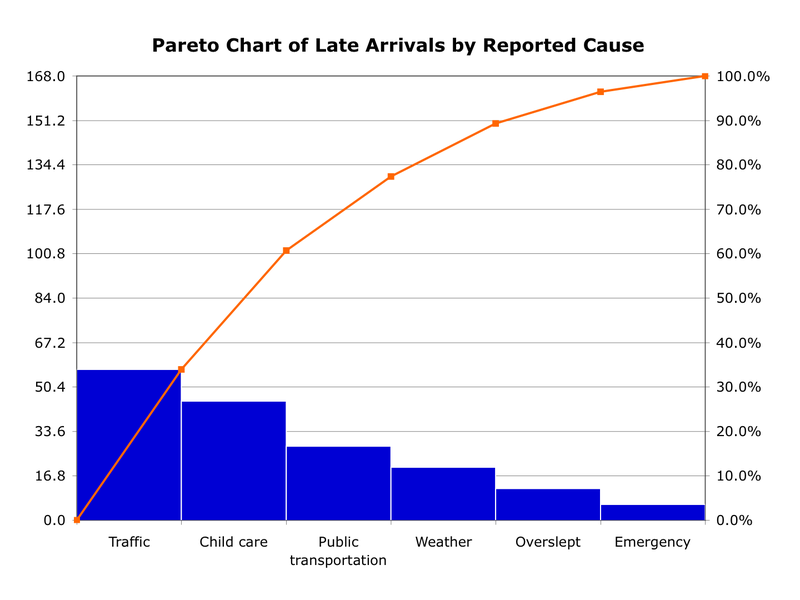
A Pareto chart can be created using excel or other similar spreadsheet software. Data is organized from highest to lowest. Data is shown using bars and lines on the chart. Along the horizontal axis you will find the data that is to be investigated. Along the left vertical axis is the frequency of occurrence. Some Pareto charts show data along the right vertical axis. This data is usually in the form of percentages and is shown by plotting a line on the chart. See the figure below for an example Pareto Chart [i].
A Pareto chart is a bar graph that organizes data from highest to lowest values, allowing users to take a large amount of data and highlight the most important pieces of information first. It helps determine the causes with the greatest impact.
WHY
A Pareto chart can show you the biggest defect in a product, or the defect that has occurred most often in returns. In HPI, a Pareto chart is a very useful way to form priorities for problems or causes by showing those that cause the most problems. Thus, it helps a HPI analyst narrow the range of options by showing data that are causing the most problems.
HOW
A Pareto chart can be created using excel or other similar spreadsheet software. Data is organized from highest to lowest. Data is shown using bars and lines on the chart. Along the horizontal axis you will find the data that is to be investigated. Along the left vertical axis is the frequency of occurrence. Some Pareto charts show data along the right vertical axis. This data is usually in the form of percentages and is shown by plotting a line on the chart. See the figure below for an example Pareto Chart [i].
ADVANTAGES
DISADVANTAGES
USE IN THE REAL WORLD
Pareto Charts are bar charts that are most often used in quality control analysis. In the figure above, you can see that the main cause for late arrivals is due to traffic, followed by child care issues. Between these two causes, more than 60% of all late arrivals are accounted for. While an organization cannot solve a traffic issue, unless they institute a teleworking program, they could choose to offer on-site daycare to reduce the number of late arrivals and consequently increase productivity.
RESOURCES
[i] Pareto Charts. Wikipedia. Retrieved April 22, 2014, from http://en.wikipedia.org/wiki/Pareto_chart
http://smallbusiness.chron.com/disadvantages-pareto-analysis-76604.html
http://www.tutorialspoint.com/management_concepts/pareto_chart_tool.htm
- Prioritizes large sets of data
- Translates data into a visual
- Easy to create
DISADVANTAGES
- Only shows frequency of qualitative data
- May identify incorrect cause if data collection is not granular enough
USE IN THE REAL WORLD
Pareto Charts are bar charts that are most often used in quality control analysis. In the figure above, you can see that the main cause for late arrivals is due to traffic, followed by child care issues. Between these two causes, more than 60% of all late arrivals are accounted for. While an organization cannot solve a traffic issue, unless they institute a teleworking program, they could choose to offer on-site daycare to reduce the number of late arrivals and consequently increase productivity.
RESOURCES
[i] Pareto Charts. Wikipedia. Retrieved April 22, 2014, from http://en.wikipedia.org/wiki/Pareto_chart
http://smallbusiness.chron.com/disadvantages-pareto-analysis-76604.html
http://www.tutorialspoint.com/management_concepts/pareto_chart_tool.htm
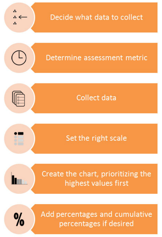
Pareto Chart JOB AID
The job aid below is intended to provide first-time practitioners guidance on how to build a Pareto Chart.